<img height="1" width="1" style="display:none" src="https://www.facebook.com/tr?id=3003101069777853&amp;ev=PageView&amp;noscript=1">

This chart basically tells investors when to sell and when to buy


By Sam Instone - April 12, 2023

Could this chart from the 1800s give investors today a way to navigate unpredictable markets?

I'm not a fan of predictions, but let's take a look...

Back in the 19th century, an American pig farmer from Ohio called Samuel Benner may have discovered the secret patterns behind asset prices.

After seeing his own assets wiped out in the panic of 1873, he created a chart forecasting the rise and fall in the average price of hogs, corn and pig-iron, identifying an 11-year cycle in the former, as well as a 27-year cycle in the latter. 

In 1875, he unveiled his 'magic formula' in Benner's Prophecies of Future Ups and Downs in Prices and since then, it's been spookily accurate at predicting the ups and downs of global stock markets, including the Wall Street Crash, the Second World War, and the dot-com bubble.
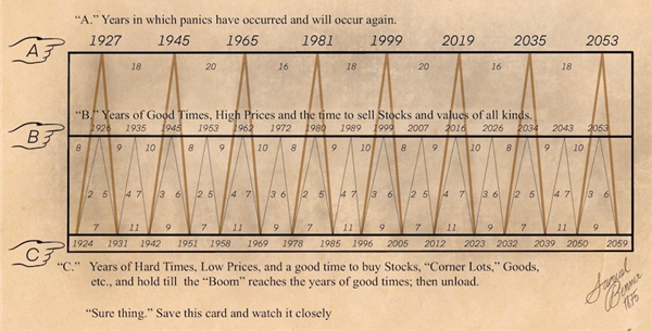
Benner cycle

The cycle identifies moves based on three time sequences:

  1. Prosperity in a 16-18-20-year pattern (meaning you should expect 16 years between the first two prosperous periods, 18 between the next two and 20 between the following two, before going back to 16);
  2. Commodity price lows in an 8-9-10-year pattern; and
  3. Recessions in a 5-6-7-year pattern
The chart basically tells investors when to sell and when to buy, earning Benner national renown as an economic guru.
 
Even today, retail investors are sharing the Benner Cycle on social media, referencing the "surprisingly accurate" forecasts that were once reprinted in newspapers of the 19th century.
 
Benner's original cycle had a limited range, only going up until 1891. However, George Tritch, another 19th century forecaster, is believed to have extended the cycle all the way to 2059, and even annotated the chart with specific instructions on when to buy and sell stocks.
 
For example, following its cycles, you'd have sold stocks in the 'B zone' of 2007, just before the financial crash in the 'A zone'.
 
Looking at the 'C zone', it's interesting that 2023 is right at the chart's bottom, hinting it will be a year of “low prices” when investors should buy and hold (after gloomy days).
 
Rationally speaking, there are a few reasons why the chart has been accurate so far.
 
It's true, markets are cyclical, just as agricultural goods are in tune with nature's cycles (solar cycles impact crop yields, affecting agricultural supply and causing ups and downs in commodity prices).
 
Human behaviour is also influenced by cycles of fear and greed and seeing prices go up and down fairly regularly won't be a surprise to many.
 
Using predictions (whether from a hog farmer or top Wall Street analyst) as a basis for your financial plan and future prosperity is a risky business. Remember, not all of Benner’s prophecies have come true.
 
We also tend to praise the charts that worked (luckily or otherwise) and forget the others - known as survivorship bias.
 
You're best taking Andrew Hallam's advice, and looking at what really drives the stock market: 

"We can’t predict future economics. And even if we could, we can’t predict how people will respond to those economics. So, here’s my advice. Don’t seek opinions on Facebook. Don’t seek opinions on Reddit. Don’t seek opinions on CNBC. Turn off the noise. Invest as soon as you have money. And invest as regularly as you can."

Save and invest for a better life